Republic Wireless Site Optimization
Smart affordable communications the big guys can't deliver
I worked as a part of a cross-functional team whose goal was to improve the online shopping experience and customer experience at Republic Wireless: a low-cost cell service provider that is disrupting the telecom industry with its innovative software. This was a big effort to clean up the customer experience across the site into simplier and more cohesive shopping experience.
The goal of this redesign was to unify the brand message and to more clearly define the funnel to conversion for prospects. This project has a quick turnaround and involve main pages like: homepage, coverage, plans, shop, phones listing page, and a promotional content strategy.
Problem: Visitors to the Republic site enter and leave the site from various endpoints- without a clear path in their shopping experience. The lack of a cohesive marketing strategy has resulted in a splintered shopping experience using complex, technical language, and over abundance of CTAs, and lack of focus in the IA.
Solution: Align the site with a clear linear path that aligns more closely with the online shopping experience- check coverage, learn about cell phone plan options, and buy a phone. One-thing-at-a-time strategy applied throughout the site
Outcome: Clearly defined shopping path, simple navigation, reduced branching paths for users while optimizing it for the mobile experience. Increased sales and comprehension of services through refined ux, content, and branding strategy.
Role: lead UX strategist and researcher, IA. Collaborated with marketing designers and researcher, and dev ui team.
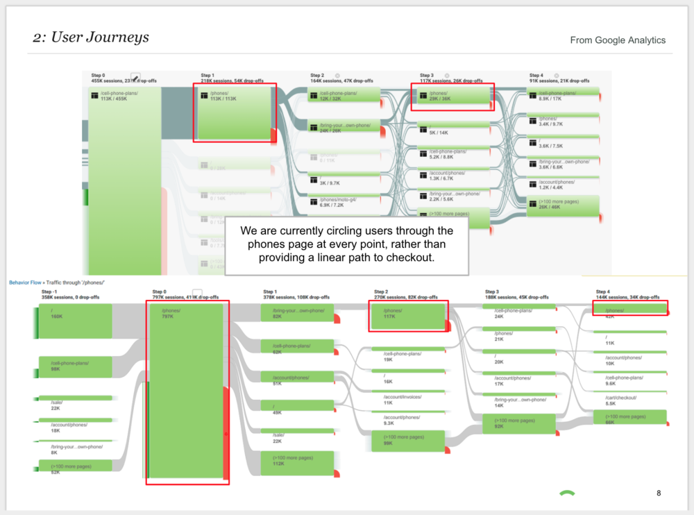
Research and mapping User journeys
Storyframing played a critical role in this user journey research, allowing us to apply target segments directly to defined flows. By designing around specific scenarios, we ensured a cohesive and frictionless path to purchase.
Because buying a phone is something that takes time, it’s important to include ways for shoppers to jump back in. We can save their items in the cart, or show view history for returning visitors.

New Information architecture
We aimed to mirror the natural shopping journey—educate first, then purchase. The objective was to create a clear, linear path to conversion by reducing navigational branching and sunsetting marketing pages that no longer supported the brand narrative.
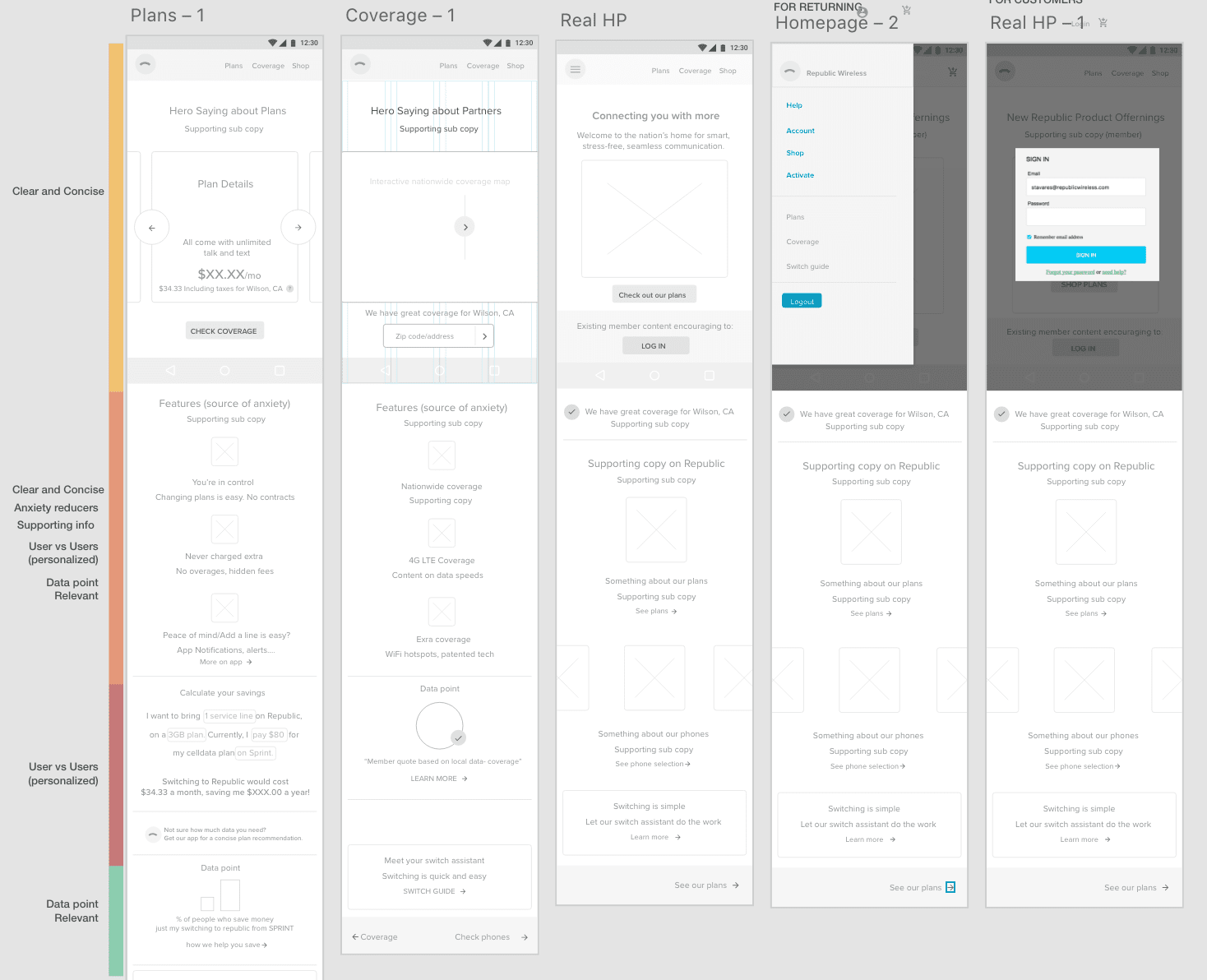
A mobile First Strategy
Our mobile traffic has increased over years to outpace desktop traffic, so it became essential to keep the mobile views of the site clean, clear, and simple.
User Testing
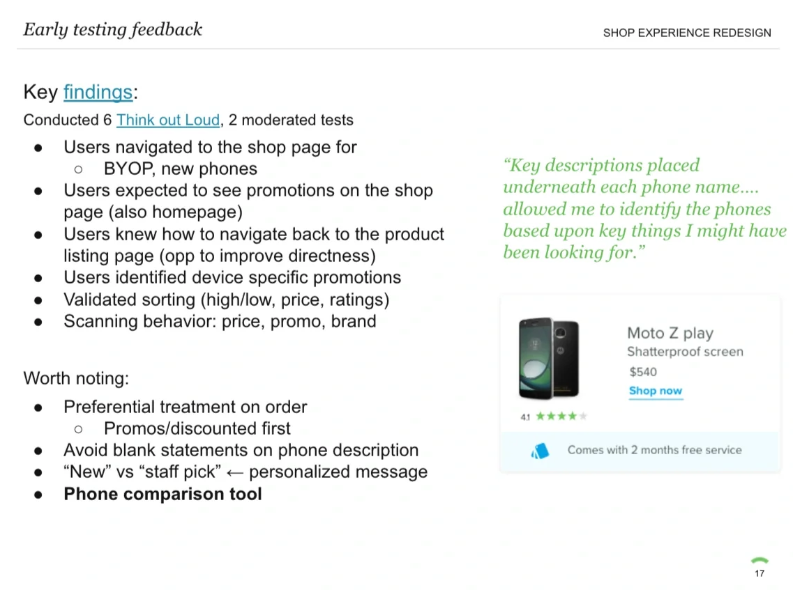
Throughout the process, I led and coordinated extensive user testing, including in-house guerrilla usability sessions, think-aloud studies, and moderated video interviews. Across multiple rounds with 20+ participants, each iteration informed refinements to the visual design based directly on user feedback.
Promotional content strategy + flexibility
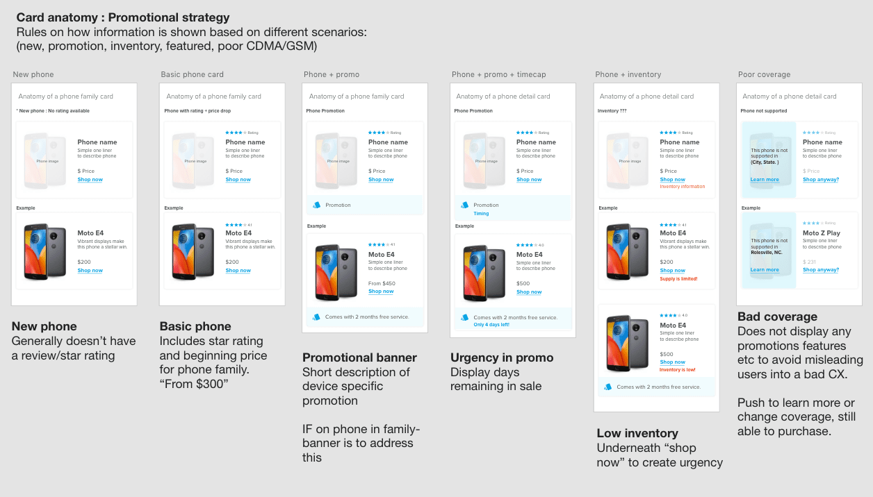
Upsell Strategy
I collaborated with our Marketing Director to develop a promotion template that added value to the page without distracting from the primary content. I also designed a flexible status system to surface key product states—such as new, out of stock, low inventory, discounted, and unavailable—clearly and consistently.
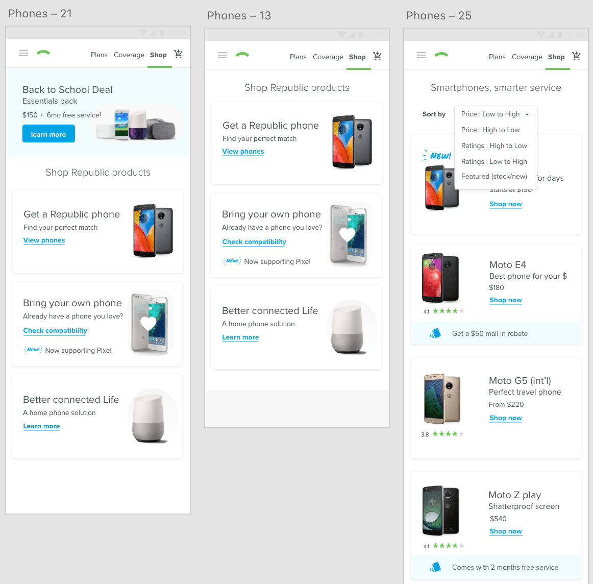
Upgraded Shop Page
To maintain a streamlined navigation, we created a dedicated Shop page to house our core products—smartphones and SIM card kits. This page acts as a central hub for browsing products, promoting sales, and highlighting new device launches.
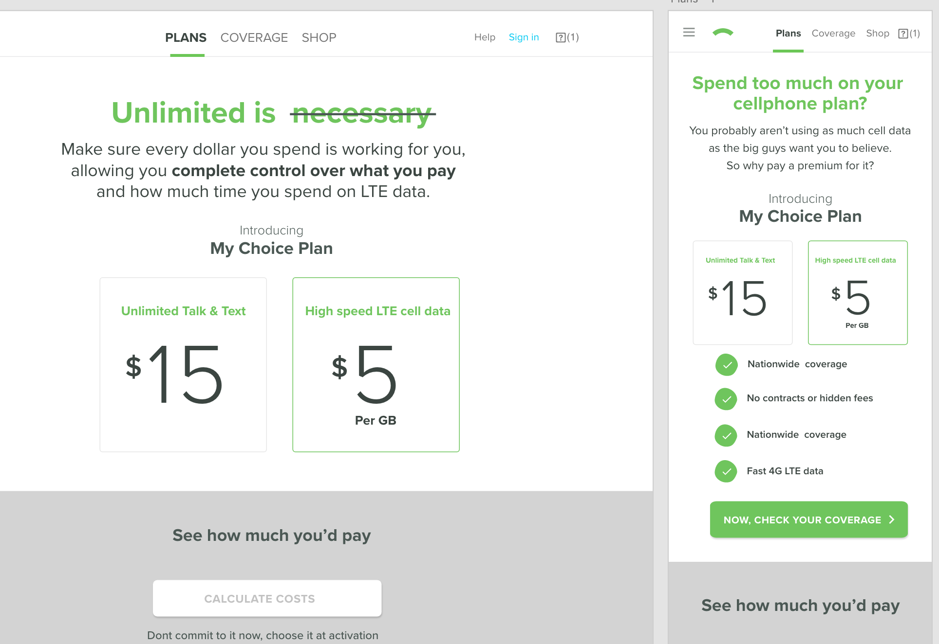
Phone Plans Page
The goal of this page was to drive awareness of the new monthly plans—how they work and the control and flexibility they offer. Its secondary objective was to convert prospects by positioning these plans as the best value in wireless.
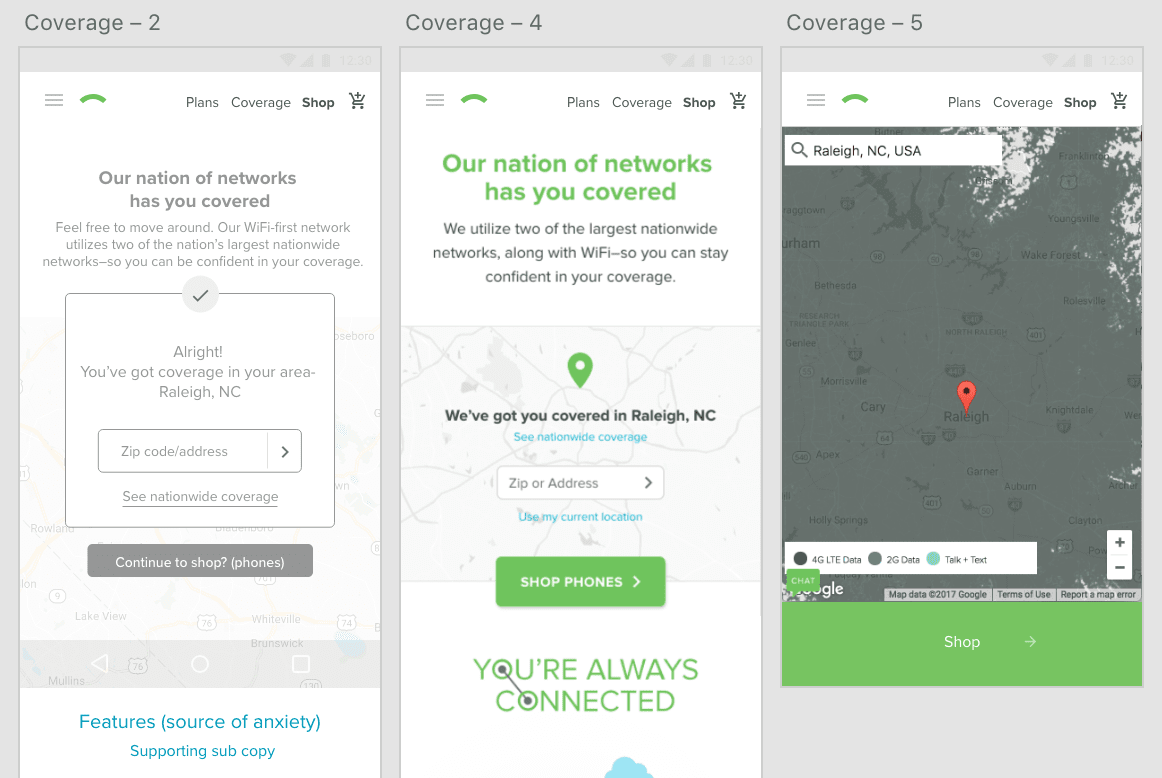
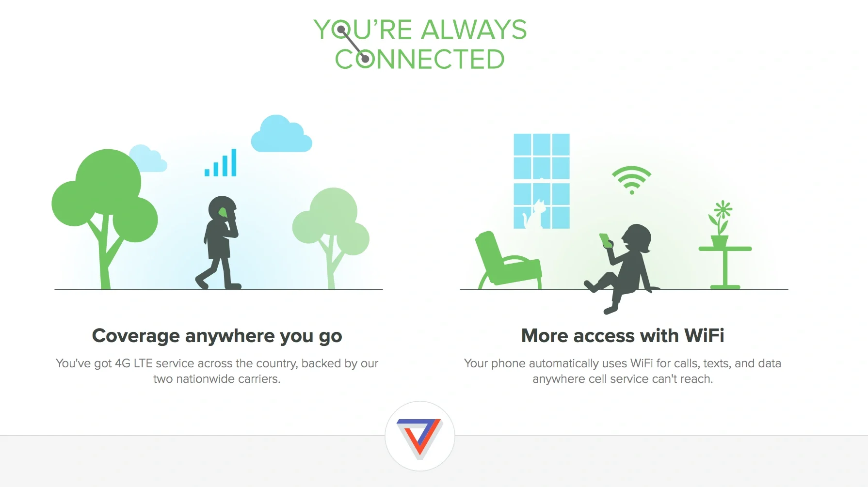
Coverage Page
We integrated a coverage map and implemented a passive IP-based check to ensure users are within supported regions.
Findings
The site redesign successfully guided users through our intended page flow: visitors moving from Homepage → Plans → Coverage → Phones rose from 1.7% pre-redesign to 17.7% post-redesign. This improvement was seen across First-Time Visitors, Prospects, and even Logged-In Members, highlighting the impact of the streamlined top navigation.
While attributing direct conversions to this new flow is challenging, the redesign prompted a broader review of our site strategy—aligning messaging, communications, and the shopping journey. It also set the stage for faster, smarter decisions through A/B testing, content optimization, and iterative branding efforts.